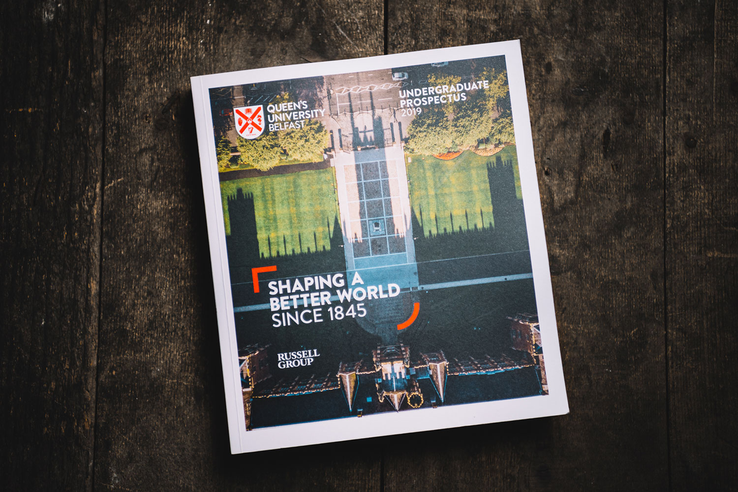
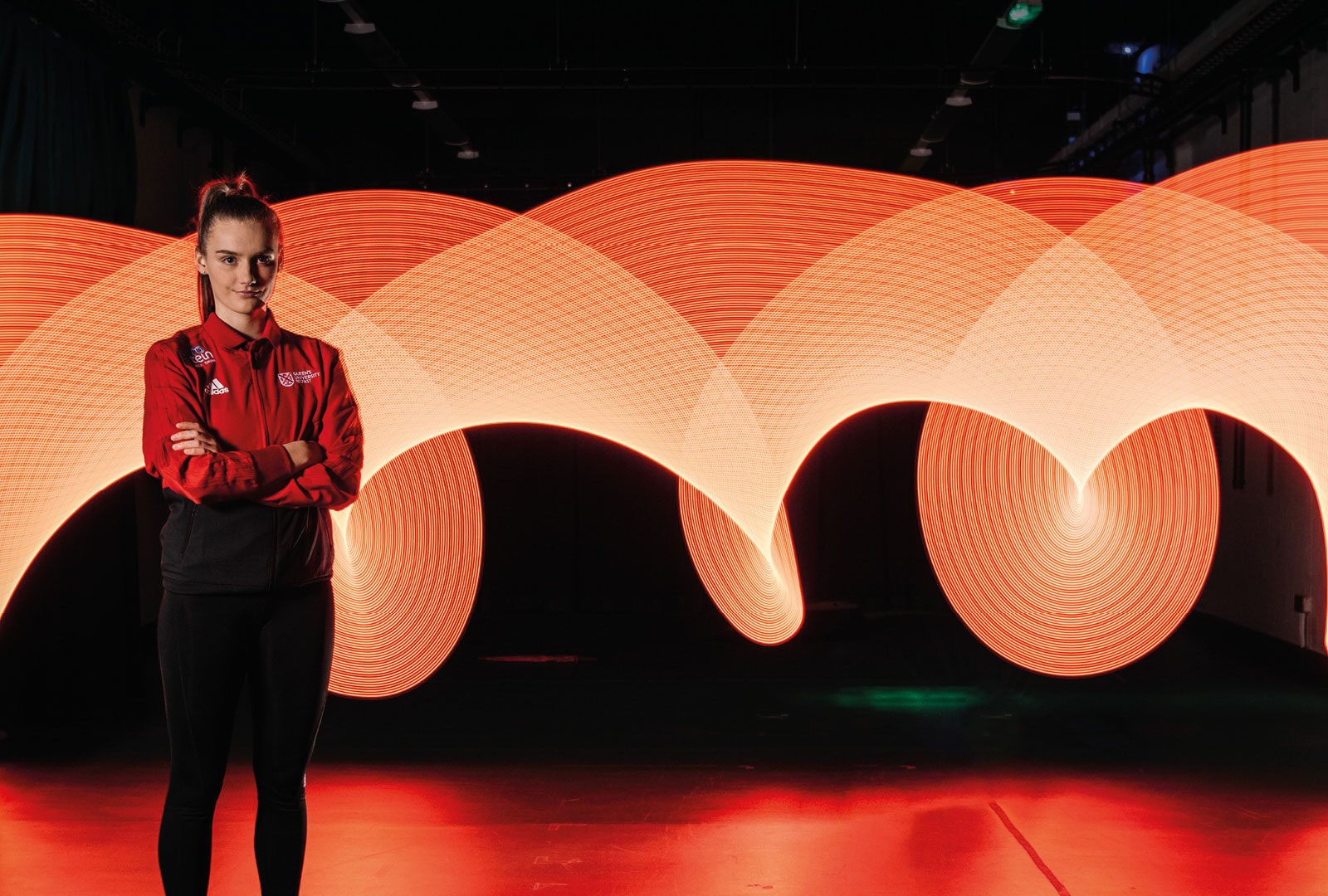
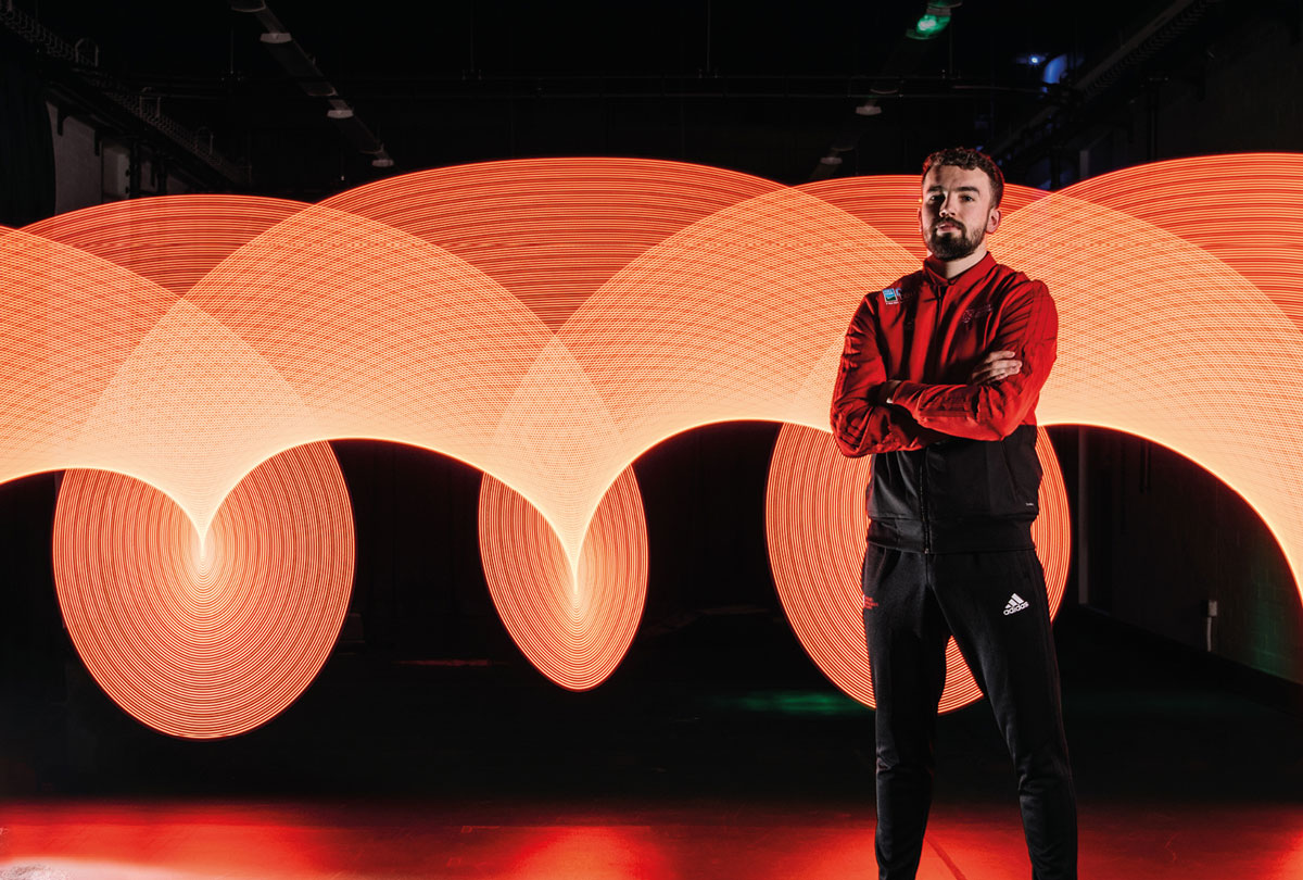
Queen’s Undergrad Prospectus

The Queen’s prospectuses are colossal.

I am an in-house designer and photographer at Queen’s, and the prospectuses are my children. Each year evolving, becoming something bigger and better than before.

Let’s be honest. There is a lot of competition out there with Universities, and students leaving schools are getting bombarded by information from everywhere about where they should go next. We need to make something that works, and works very well.

In 2016, I was handed the gargantuan task of redesigning and rethinking the prospectus from the page size up. This is my bag.

1
full redesign
0
prospectus designs
(UG, PG & International)
0
cups of coffee
NO HALF MEASURES

With everything, a lot of research is needed at the start. This wasn’t just trawling through the internet and grad fairs, this was talking to students at focus groups about typography, imagery, sizes and shapes of other prospectuses they’d seen. We really wanted to get down to what exactly was cool. What we discovered was the beginning of a winning formula. They wanted different. They wanted big. They wanted cool. I listened.

LAYOUT

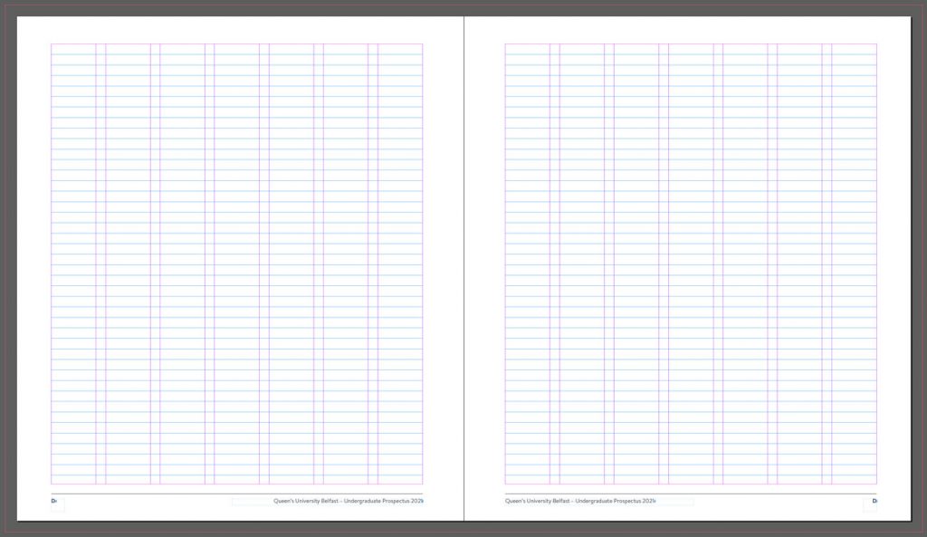
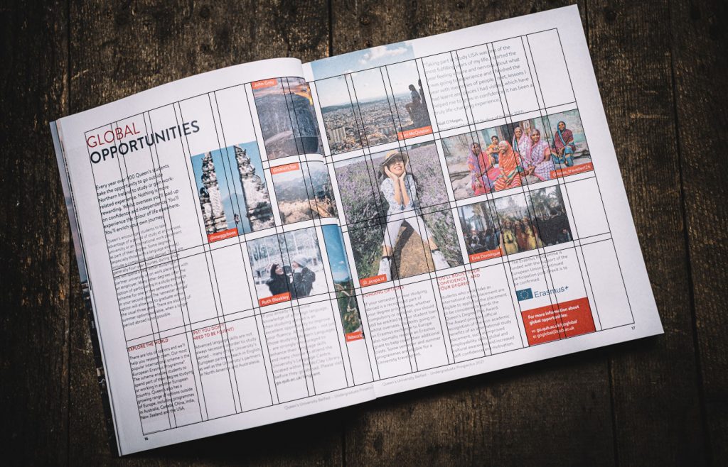
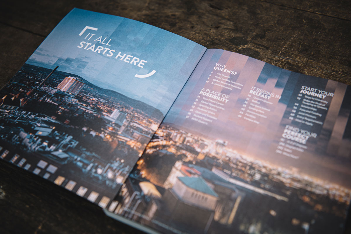
After a lot of trial and error. I ended up with a nice obsure size of 195x220mm. Almost, but not quite, square. To make it better, I used a really even 7 columns on this page, giving 14 columns in total on a double page spread – This might sound a bit nuts, but once you see it and how it works, it really makes my life so much easier. This is it:

Believe it or not, this allows me to be super flexible and super creative with each spread, making everything look different, but the same. Here it is in action:

PHOTOGRAPHY

Next was the imagery. I had taught myself photography outside of work. It is an obsession. A passion. A creative release.

I had a vision for each empty area on every page and needed see it all through myself. Year on year, THIS has been the evolution in the prospectus. From location shots around Northern Ireland, to students in labs. It has changed how I look at this job.

These are a few of my favourite shots from previous prospectuses:

This video is a bit of a behind the scenes of how I planned and shot the intro page for the sport section in the prospectus. Head over to my Instagram to see more in my ‘highlights’, or follow me for more in the future.

ABOVE & BEYOND

Litterally. After adding photography to my job role, I decided to get a drone and complete the intense training to get my PfCO license which allows me to use it for the university. I mean. It’s a camera on a mini helecopter that fits in your backpack. It’s awesome!

The above shot on the 2020 undergrad cover took a LOT of planning and patience to get the shape of the building perfectly centred on the lawn at Queen’s. It also was nominated for a British Photography award in 2019, also winning first place in Fotospeed’s weekly photography competition.

With all of this, I created something I could call my best work. Design-wise and photography-wise. Below is a mix of shots from the last few editions. Individual publications are on my blog.

Like that, did yee?
Why not check out some more stuff, or if that convinced you, let's have a chat.